Victorian homes are the show-offs of American architecture. They have turrets, wraparound porches, decorative brackets, fish-scale shingles and trim that looks like it was cut with a tiny saw. All that detail is a gift, but it can also make choosing exterior paint colors feel overwhelming. The secret is to keep it simple. A well-chosen three-color palette lets the architecture shine without turning the house into a rainbow. This guide explains how the three-color system works, where each color goes and which combinations look beautiful on a Victorian. Each palette includes suggested paint colors so you can take the ideas straight to your paint store.
What Makes a Victorian a Victorian
Before you pick colors, take a walk around your home and notice its details. Victorian is a broad term that covers several styles, including Queen Anne, Italianate, Second Empire and Gothic Revival, but most share these features: • Decorative trim such as brackets, spindles, scrollwork and gingerbread • Steep rooflines with gables, towers or turrets • Textured siding, including fish-scale shingles and horizontal clapboard • Wraparound porches with turned posts and railings • Tall, narrow windows with ornate frames • Asymmetrical shapes that create lots of nooks and corners Each of these is a chance to show off a color, so the goal is to decide which details deserve attention and which should stay quiet.
The Three-Color System Explained
Most Victorian homes look best with three main colors, each with its own job. 1. Body color: the largest surface of the house, usually the siding. It sets the overall mood. 2. Trim color: the frames around windows and doors, corner boards, fascia, porch railings and baseboards. It outlines the shape of the house. 3. Accent color: the finishing touch, used on decorative details like brackets, spindles, shutters, porch ceilings and the front door. This simple structure keeps the design organized. If you have a lot of ornament and want to go further, you can add an optional fourth color for one or two special features, such as a front door or a porch floor, but start with three and see how it feels.
Start with What You Cannot Change
Your palette has to work with the parts of the house that will not change. • Roof: Slate gray, black and brown roofs each lean toward certain palettes. Look for warm or cool undertones. • Brick or stone foundation: Match the undertones of the masonry so your colors feel connected. • Landscaping and neighbors: Mature trees and nearby homes are part of the setting, so choose colors that feel at home on your street. Hold paint chips against your roof and foundation before you decide.
10 Victorian Three-Color Palettes
Paint colors below are from Sherwin-Williams. The swatches are close on-screen approximations, so always confirm with a real paint sample before you buy.
1. Sage, Cream and Deep Red
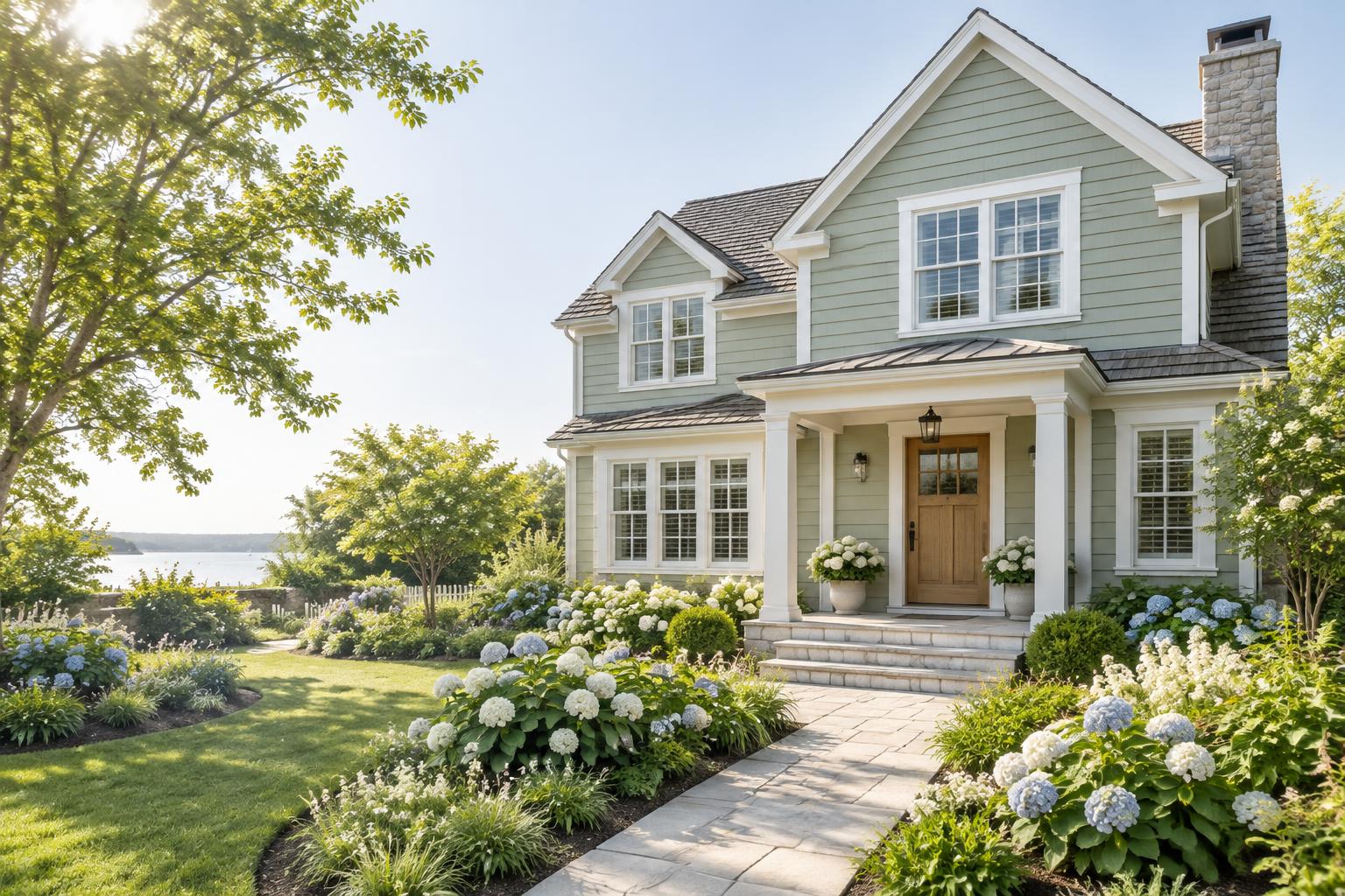
Body: Svelte Sage — SW 6164 Trim: Alabaster — SW 7008 Accent: Rookwood Red — SW 2802 Sage green is a classic Victorian color that feels natural and calm. Cream trim brings out the woodwork, and a deep red accent on brackets and the front door adds richness.

2. Dusty Blue, White and Gold
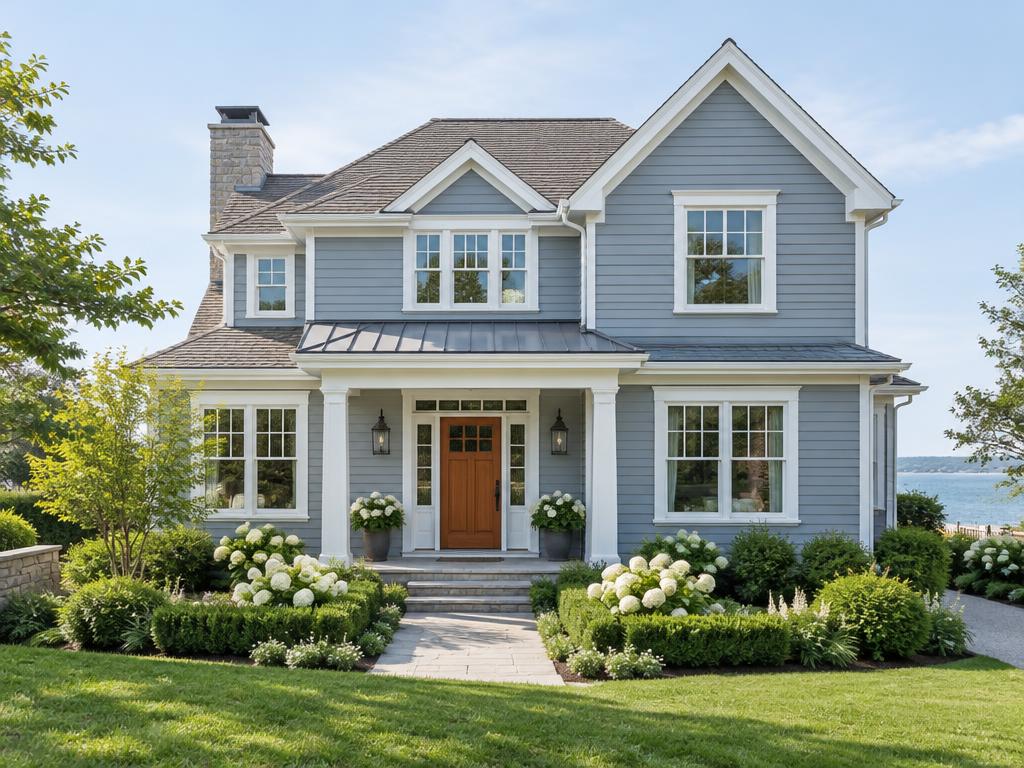
Body: Languid Blue — SW 6226 Trim: Pure White — SW 7005 Accent: Humble Gold — SW 6377 A soft blue body feels fresh and charming. Crisp white trim keeps it clean, and golden accents on the gingerbread and door make the details sparkle.

3. Deep Green, Soft White and Terracotta
Body: Dried Thyme — SW 6186 Trim: Shoji White — SW 7042 Accent: Cavern Clay — SW 7701 A rich green body looks stately and traditional. Soft white trim glows against it, and terracotta accents add warmth and a hint of old-world charm.

4. Soft Gray, White and Navy
Body: Passive — SW 7064 Trim: Pure White — SW 7005 Accent: Naval — SW 6244 A light gray body gives a modern, polished feel while still respecting the architecture. Navy accents add depth and elegance to the brackets, porch details and door.

5. Butter Cream, White and Forest Green
Body: Navajo White — SW 6126 Trim: Pure White — SW 7005 Accent: Rookwood Dark Green — SW 2816 Warm cream siding has a sunny, welcoming look. Forest green accents ground the palette and make the decorative trim stand out.

6. Charcoal, Cream and Gold
Body: Peppercorn — SW 7674 Trim: Alabaster — SW 7008 Accent: Humble Gold — SW 6377 Dark charcoal makes a dramatic backdrop for ornate trim. Cream trim and gold accents give the house a glamorous, storybook look.

7. Blush, White and Sage
Body: Redend Point — SW 9081 Trim: Pure White — SW 7005 Accent: Evergreen Fog — SW 9130 A warm blush-beige body feels soft and romantic. White trim keeps it crisp, and sage accents add a gentle contrast.

8. Rich Brown, Tan and Rust
Body: Urbane Bronze — SW 7048 Trim: Kilim Beige — SW 6106 Accent: Cavern Clay — SW 7701 Deep brown siding with tan trim has an authentic, historic feel. Rust accents bring a warm glow, especially in autumn light.

9. Teal, Cream and Coral Red
Body: Rainstorm — SW 6230 Trim: Alabaster — SW 7008 Accent: Fireweed — SW 6328 A deep teal body is bold and unforgettable. Cream trim lightens the look, and a warm coral-red accent lets the details pop.

10. Greige, White and Black
Body: Accessible Beige — SW 7036 Trim: Pure White — SW 7005 Accent: Tricorn Black — SW 6258 Greige is a calm neutral that suits almost any roof. White trim and black accents give a clean, graphic look that feels modern and timeless at the same time.

Where to Place Each Color
A few simple guidelines keep the palette balanced. • Use the body color on the main walls, including the siding and shingles. • Paint trim consistently. Use the trim color on window frames, corner boards, fascia and porch railings so the shape of the house reads clearly. • Save the accent for the details. Brackets, spindles, porch ceilings, shutters and the front door are the best places for it. • Treat gables and shingles as a design moment. You can use the accent or a slightly darker body color on fish-scale shingles to add depth. • Balance dark and light. Spread darker colors around the house so it does not look lopsided.
Choosing the Right Finish
The sheen of your paint affects how colors look and how well they last. • Siding and shingles: flat or low-sheen finishes look soft and historic. • Trim and brackets: satin or semi-gloss makes the details crisp and easy to clean. • Doors: semi-gloss or gloss gives a rich, durable finish. • Porch floors: use a floor-rated enamel in satin. Always follow the product label for temperature range, primer needs and drying times.
How to Test Your Colors
Victorian homes have a lot of surfaces and angles, so test carefully. 1. Paint large samples, at least two feet square, on primed boards. 2. Test trim and accent colors too, not just the body. 3. Move samples around the house, since light changes from wall to wall. 4. Check them at different times of day, including morning, midday and evening. 5. Step back to the street and see how the palette looks from a distance.
Common Mistakes to Avoid
• Using too many colors. More ornament does not mean more colors. Stick to three or four. • Choosing trim that is too close to the body. Without contrast, the details disappear. • Ignoring the roof and foundation. These are major colors on the house even if you are not painting them. • Skipping the test. A color that looks perfect on a chip can look very different on a large wall. • Forgetting local rules. If you live in a historic district, check the guidelines before you buy paint.
Final Thoughts
A Victorian house deserves colors that celebrate its personality. Start with your roof and foundation, choose a body color you love, pick a trim color that defines the details and finish with an accent that makes you smile. Keep it to three colors, test every sample in real light and take your time. With a thoughtful palette, your Victorian can look elegant, welcoming and full of charm for many years to come.
Paint colors are from Sherwin-Williams. The swatches are close on-screen approximations, so always confirm with a real paint sample before you buy. The cover photo is an AI-generated illustration.