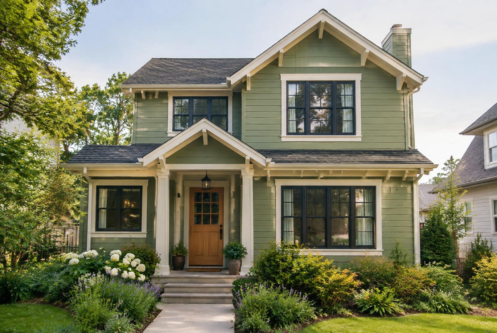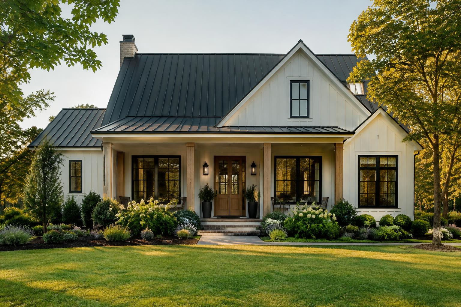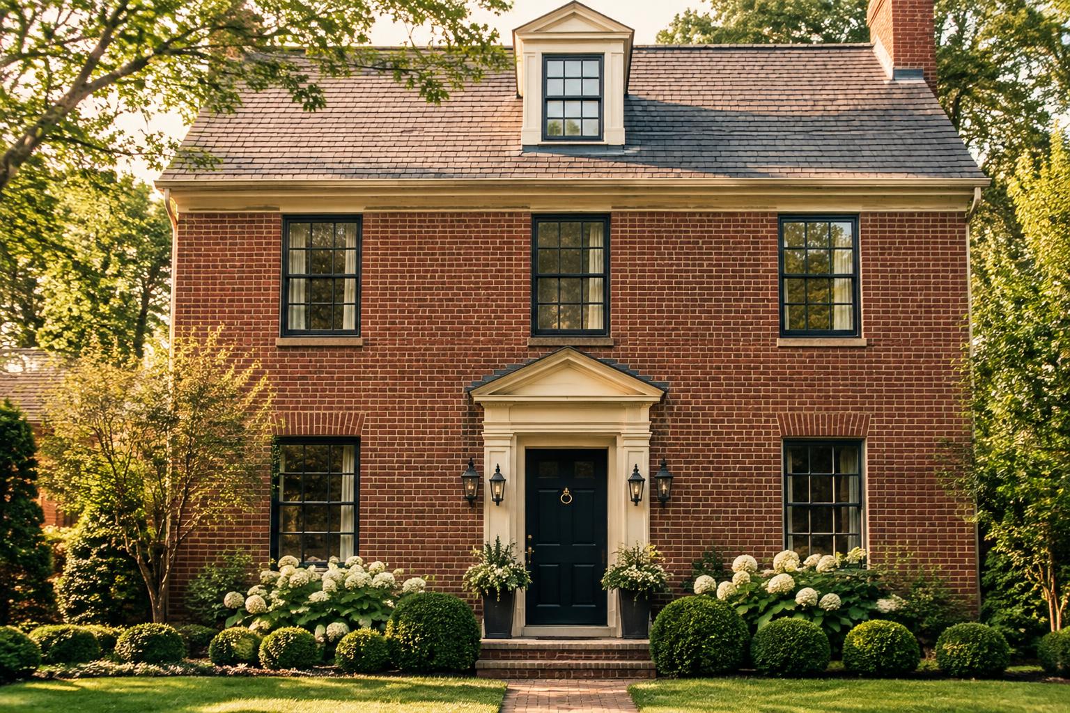
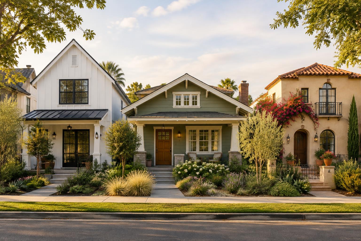
Choosing the right exterior paint color involves more than finding a shade you love. The best color should complement your home's architectural style, highlight its distinctive features, and coordinate with existing elements such as roofing, brick, stone, and landscaping. Sherwin-Williams offers a wide range of exterior paint colors, from timeless whites and warm neutrals to deep greens, blues, and earthy browns. Its official architectural color collections also provide palettes tailored to different home styles, including traditional, modern, Craftsman, Spanish, and beach-inspired homes. Whether you own a modern farmhouse, a traditional Colonial, a Craftsman bungalow, or a Spanish-style home, this guide will help you explore Sherwin-Williams exterior house colors that suit your home's architecture.
How to Choose Sherwin-Williams Exterior Colors for Your Home
Before selecting a paint color, consider three important factors. • Architectural style: Traditional homes often suit classic, balanced palettes, while modern homes can accommodate stronger contrasts and simpler color schemes. • Existing materials: Roof shingles, brickwork, stone, and other permanent features influence which paint colors will look harmonious. • Color placement: The main siding color, trim, shutters, and front door should work together rather than compete for attention. Sherwin-Williams also recommends considering the surrounding environment when selecting exterior colors. A palette that looks balanced in a wooded setting may feel different in a sunny, open landscape. The following sections explore suitable Sherwin-Williams colors and combinations for popular architectural styles, with color codes to help you begin building your own palette.
1. Modern Farmhouse: Warm Whites, Charcoal, and Natural Accents
Modern farmhouse homes are known for their simple rooflines, prominent gables, clean trim, and understated materials. The right Sherwin-Williams exterior colors can emphasize these features without making the home feel too stark or overly decorative. Warm whites, soft greiges, muted greens, and charcoal accents are excellent starting points for this architectural style. How to choose: If your home has black windows and a dark roof, a warm white or light greige can provide balance. If you already have plenty of dark elements, consider a muted green or medium neutral instead of adding more black. For more combinations, explore the official Sherwin-Williams modern exterior color collection. Its palettes include shades such as Wool Skein, Artisan Tan, and Status Bronze.
2. Traditional and Colonial Homes: Timeless Neutrals and Classic Contrasts
Traditional homes, including Colonial-style houses and many established suburban homes, often feature symmetrical windows, defined trim, shutters, and balanced proportions. These architectural details usually benefit from colors that feel coordinated rather than overly dramatic. White, gray, beige, muted blue, and restrained green are all worth considering. Both combinations are drawn from Sherwin-Williams' traditional exterior palettes. How to choose: For a Colonial home, decide how much contrast you want around the windows, shutters, and entry. A white-and-gray scheme emphasizes the architecture, while sage green creates a more relaxed appearance. Coordinate the palette with the roof and any existing brickwork.
3. Craftsman Bungalows: Earthy Greens, Golds, and Warm Whites
Craftsman homes are recognized for their broad porches, tapered columns, exposed rafters, natural materials, and substantial trim. Their architectural character often pairs beautifully with colors inspired by nature. Instead of relying only on white and black, consider olive green, muted gold, warm gray, cream, and earthy brown. Sherwin-Williams features Eastlake Gold, Classical White, and Curio Gray in its architectural Craftsman collection. Its historic color resources are also useful when you want a period-inspired scheme. How to choose: Use the main siding color to establish the overall appearance, then use trim to highlight porch columns, window casings, and fascia. Keep darker colors for selected architectural details so the home doesn't lose its layered character.
4. Mid-Century Modern Homes: Clean Neutrals and Confident Accents
Mid-century modern homes often feature low rooflines, horizontal forms, large windows, and a close relationship between indoor and outdoor spaces. Their simple geometry gives homeowners more freedom to experiment with distinctive accent colors. Soft gray, warm white, muted green, earthy tan, and carefully chosen bronze or gold accents can all work well. How to choose: Look at the home's original materials before introducing color. If it features natural wood, stone, or distinctive masonry, let those elements remain part of the overall palette. Use accent colors to emphasize the entry, selected panels, or other intentional design features.
5. Spanish and Mediterranean Homes: Warm Earth Tones and Soft Neutrals
Spanish and Mediterranean homes commonly feature stucco walls, arched openings, terracotta roof tiles, decorative details, and rich natural textures. Their exterior colors tend to look most harmonious when they complement these warm materials. Think sand, cream, tan, clay, muted brown, and selected deep accents rather than stark, high-contrast color schemes. How to choose: Let your roof tiles and existing masonry guide the decision. If the roof is already strongly red or orange, a softer sandy neutral can balance it. If the exterior is mostly pale stucco, a deeper brown or muted accent can provide definition without overpowering the architecture.
6. Coastal and Beach Houses: Soft Blues, Whites, and Sea-Inspired Greens
Coastal homes often look best in colors that feel light, relaxed, and connected to their surroundings. Depending on the region and architectural details, this could mean pale blue siding, soft white trim, sandy beige, muted aqua, or subdued green. How to choose: For a traditional coastal cottage, lighter siding and contrasting trim can highlight the windows and porch. For a contemporary beach home, a restrained neutral palette with a blue-green accent may feel more appropriate. Remember that homes near the coast may require coatings and preparation suitable for moisture and salt exposure. Color selection is only one part of a durable exterior finish.
7. Ranch-Style Homes: Versatile Neutrals and Nature-Inspired Colors
Ranch-style houses are usually long and relatively low, with simple rooflines and broad front elevations. Because the facade stretches horizontally, color placement can influence how balanced the home appears. Warm beige, greige, light gray, muted green, and soft white are useful starting points. A carefully selected darker color on the front door or shutters can add definition without visually fragmenting the facade. How to choose: If your ranch has a long, uninterrupted front wall, one main siding color can help the facade feel cohesive. Use a second color only where it emphasizes an architectural feature, such as the entry, garage, or a change in exterior material.
8. Victorian Homes: Rich Colors and Decorative Contrast
Victorian homes often have ornate trim, decorative gables, detailed porch railings, and multiple architectural elements. Their exterior colors can highlight this craftsmanship. Unlike a minimalist modern home, a Victorian house may benefit from several coordinated shades. The key is to distinguish the main body, major trim, and smaller decorative details without making every element compete for attention. The Green Earth combination comes from Sherwin-Williams' traditional collection, while Red Barn is another listed traditional exterior color. These palettes offer starting points for a heritage-inspired design, not a guarantee of historical accuracy. How to choose: Look at the age of the house and the details you want to emphasize. For a historically significant property, investigate colors appropriate to its particular period and check local preservation requirements before painting.
How to Test Sherwin-Williams Exterior Colors Before Painting
Even a well-coordinated palette can look different on your actual home. Before buying all the paint, follow these steps. 1. Identify your fixed materials. Record the colors of your roof, brick, stone, foundation, and other features that will remain unchanged. 2. Choose two or three candidate palettes. Narrow your options according to architectural style and the overall mood you want. 3. Order physical paint samples. Digital swatches and photographs are useful for comparing colors, but they cannot reproduce every paint color accurately. 4. Test the colors outdoors. Apply samples to suitable surfaces or sample boards and observe them in different lighting conditions. 5. Evaluate the complete combination. Check the siding, trim, roof, and accent colors together before making your final decision. 6. Confirm the correct exterior product. Choose a paint system suitable for the substrate and exposure, and check any HOA or local restrictions.
Final Thoughts
The best Sherwin-Williams exterior house colors are the ones that complement your home's architecture and work with its existing materials. Modern farmhouses often suit warm whites and charcoal accents, Craftsman bungalows lend themselves to earthy colors, and Spanish-style homes frequently harmonize with sandy neutrals and terracotta-inspired tones. Start with your architectural style, narrow the options to two or three palettes, and test physical samples before making a final decision.
The cover image is AI-generated. The color tables in the supplied PDF did not come through, so each house color example is built from the colors the text describes or names; on-screen colors are approximate. Always test physical samples on your home.