A small Craftsman house has a lot going for it. The low-pitched roof, wide eaves, tapered porch columns and handsome woodwork give it charm that bigger homes often lack. But a compact footprint also means your paint colors have a big job to do. The right palette can make the house feel cozy and well proportioned, while the wrong one can make it look cramped, flat or busy. The good news is that Craftsman homes were designed to sit close to nature, so their best colors tend to be earthy, layered and easy to live with. This guide walks you through how to choose colors step by step, from understanding your home's details to testing samples on the wall.
Start with What Makes a Craftsman a Craftsman
Before you pick a single color, take a slow walk around the outside of your house and notice its details. Craftsman architecture is built on honest materials and visible craftsmanship, and your paint should show those features off rather than hide them. Look for: • Exposed rafter tails and brackets under the eaves • Tapered or square porch columns sitting on stone or brick piers • Multi-pane windows, often with a divided upper sash • Wide trim boards around windows, doors and corners • Gables with decorative vents, shingles or stickwork • Natural materials such as stone, brick, cedar shingles and wood Each of these is an opportunity. In a small house, a few well-chosen contrasts will draw the eye to the details and make the whole home feel richer.
Look at the Colors You Cannot Change
Your roof, stone, brick and any fixed elements already have a color and an undertone. A new paint palette has to work with them, not against them. • Roof: Note whether it is warm (brown, rust) or cool (charcoal, slate). • Stone or brick piers: Look for hints of red, tan, gray or gold in the stone. • Driveway and walkways: Concrete and pavers can lean warm or cool. • Landscaping: Mature trees, shrubs and flowers set the backdrop your colors will be seen against. Hold a few paint chips right next to the stone or brick. If the colors look like they belong together, you are on the right track. If one looks muddy or sharp beside the other, try a different undertone.
Use a Simple Three-Color System
Small homes look best with a restrained palette. Most Craftsman houses use three main colors, with a fourth reserved for a special accent. 1. Body color: The main siding color. This takes up the most visual space. 2. Trim color: For window frames, corner boards, fascia and porch details. 3. Accent color: For the front door, and sometimes the porch ceiling or shutters. This structure keeps the home looking organized. Too many colors can break up a small facade and make it feel smaller, while a tight palette gives it a calm, confident presence.
Choose a Body Color That Works for a Small Home
The body color sets the personality of the house, so spend the most time on this decision. A few guidelines help. Medium and mid-tone colors are friendly to small homes. Muted greens, warm grays, soft blues and earthy taupes look rich without feeling heavy. They also show off trim and shadow lines beautifully. Lighter colors can open up a compact house. Soft creams, pale sage and light greige reflect more light and help the home look a bit larger, which can be helpful on a narrow or shaded lot. Dark colors can work, with care. Deep forest green, charcoal and brown-black look dramatic on a Craftsman and can make a small house feel substantial and cozy. They work best when the trim is noticeably lighter, so the details do not disappear. Pay attention to your lot. A house tucked under tall trees often benefits from a slightly lighter or warmer shade, since shade can make colors look darker and cooler. A house in full sun can handle richer, deeper colors.
Pick Trim Colors That Highlight the Woodwork
Craftsman trim is wide and sturdy, so it deserves to be seen. Clear contrast between the body and the trim makes the architecture pop. • Warm cream or ivory gives a softer, more traditional look than bright white. • Crisp white feels fresh and works especially well with greens, blues and grays. • A darker trim color, such as deep brown or charcoal, creates a rich, historic look when paired with a light body color. If you want to emphasize the exposed rafter tails and brackets, consider painting them the same color as the trim, or one step darker than the body for a subtle shadow effect. Painting the eaves and fascia a slightly different color can also add depth in a small space.
Make the Front Door the Star
On a small house, the front door is a natural focal point. It is the place where you can be a little bolder without overwhelming the facade. • Deep red or burgundy feels welcoming and looks beautiful against green or tan. • Warm mustard or gold has a cheerful, vintage feel. • Navy or deep teal adds a cool pop against warm brown or cream. • Natural stained wood honors the Craftsman tradition and pairs well with almost any palette. A satin or semi-gloss finish helps the door stand out and wipes clean easily.
Six Craftsman Palettes to Try
Here are six combinations that suit small Craftsman homes. Treat them as starting points and adjust to your own roof, stone and landscaping.
1. Forest Green and Cream
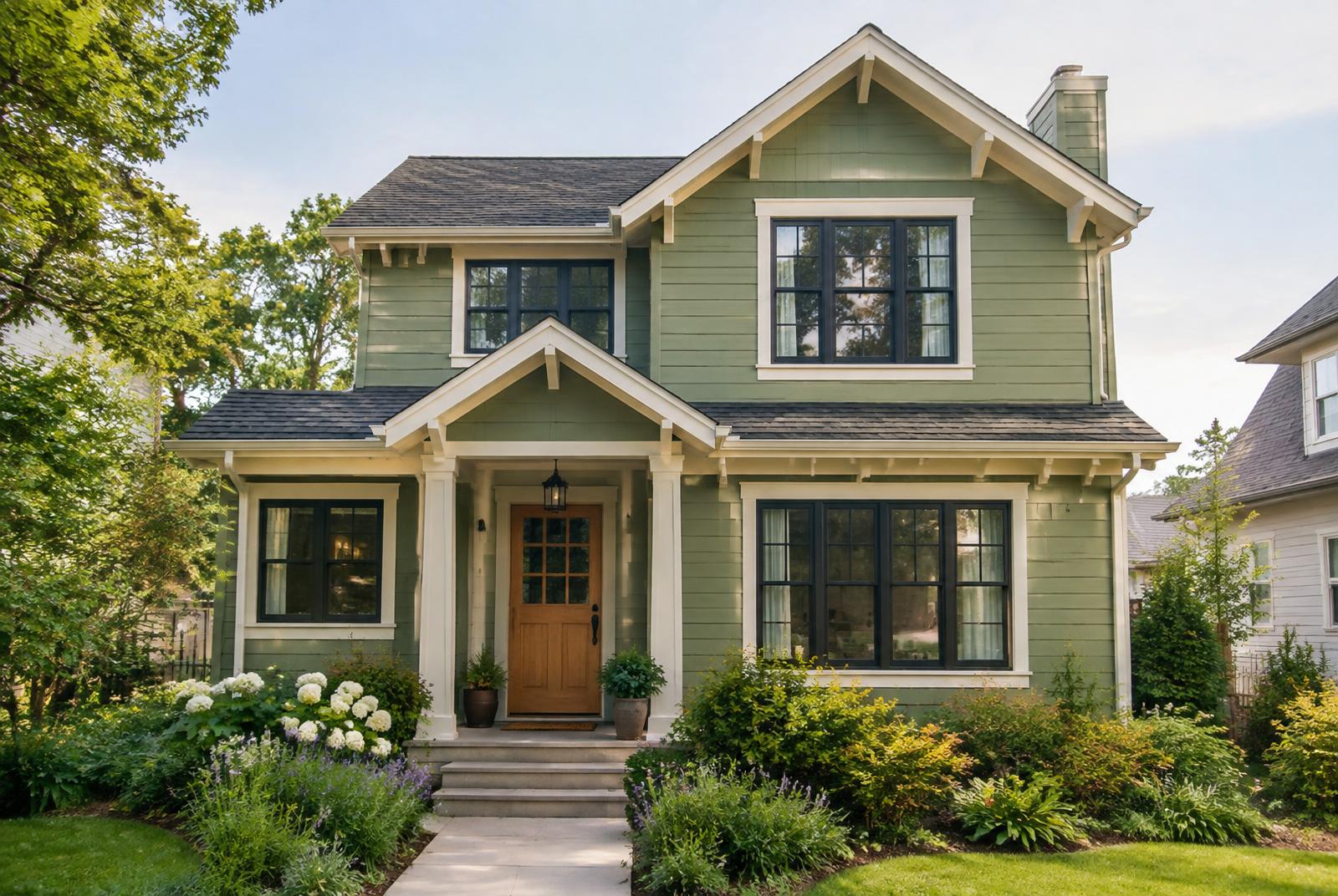
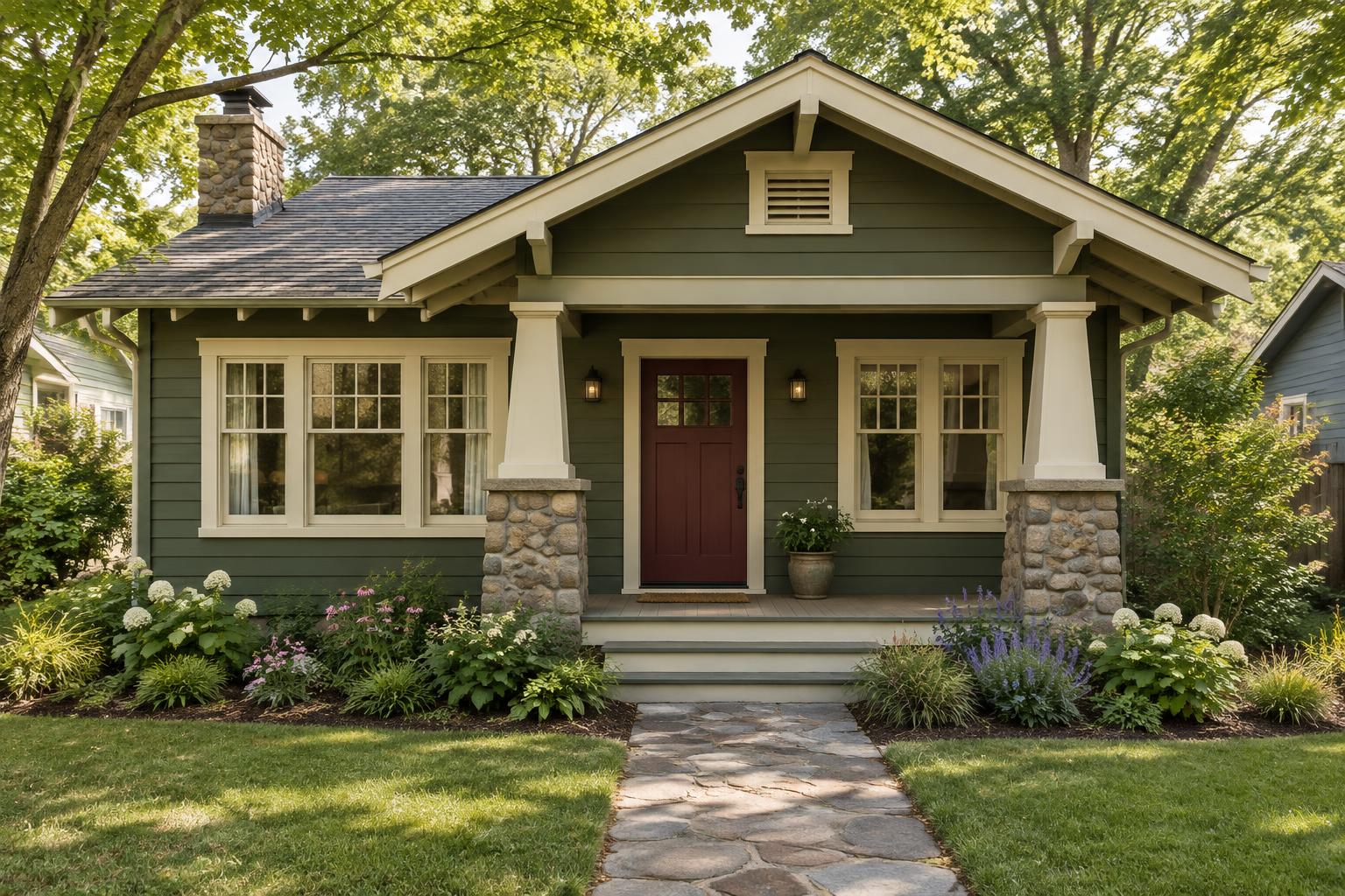
Body: muted forest green. Trim: warm cream. Accent: burgundy door. A classic that looks at home among trees.
2. Warm Gray and Natural Wood
Body: warm gray. Trim: soft white. Accent: stained wood door and porch ceiling in pale blue. Quiet, modern and inviting.
3. Sage and Walnut
Body: soft sage green. Trim: ivory. Accent: walnut brown door and darker brown rafter tails. Earthy and calm.
4. Slate Blue and White
Body: dusty slate blue. Trim: crisp white. Accent: deep red door. Fresh, balanced and timeless.
5. Mustard and Deep Brown
Body: muted golden tan. Trim: dark brown. Accent: deep green door. Warm and historic with real personality.
6. Charcoal and Cream
Body: soft charcoal. Trim: cream. Accent: golden yellow door. Bold, cozy and surprisingly elegant on a small house.
Think About Sheen
The finish you choose affects how colors look and how well they last. As a general rule: • Siding and shingles: flat or low-sheen finishes hide imperfections and look natural. • Trim and eaves: satin or semi-gloss defines the details and stands up to weather. • Doors and porch rails: semi-gloss is durable and easy to clean. • Porch floors: use a floor-rated enamel in satin. Always read the label on your paint, and follow the recommendations for temperature and recoat times.
Test Your Colors the Right Way
It is tempting to choose from a tiny paint chip, but exterior colors change dramatically in daylight. Follow these steps for the best results. 1. Paint large samples. Aim for at least two feet square, on primed boards or directly on the house. 2. Test on every side. The north side may look darker and cooler than the south side. 3. Check different times of day. Look in morning light, midday sun, late afternoon and evening. 4. View samples next to fixed elements. Compare them with your roof, stone and landscaping. 5. Look from the street. Step back and see how the colors read from where visitors will see them. Take your time. A week with your samples will save you from years with a color you do not love.
Common Mistakes to Avoid
• Using too many colors. Stick to three or four so the home looks cohesive. • Ignoring undertones. A warm trim can look dirty beside a cool body color, and vice versa. • Forgetting the roof. The roof is a major color on the house, even if you are not painting it. • Choosing trim that is too close to the body. Without contrast, the Craftsman details get lost. • Skipping the neighborhood. Take a look at nearby homes so your palette feels harmonious, and check any HOA or historic district rules before you buy paint.
Final Thoughts
Choosing paint colors for a small Craftsman house is about balance. Respect the home's natural materials and handcrafted details, keep the palette simple, and let the trim and door add personality. With a little patience and good sample testing, you will end up with a house that looks warm, inviting and perfectly suited to its size. When the colors are right, a small Craftsman does not look small at all. It looks like a cozy, confident home with a story to tell.
The cover image is an AI-generated illustration of a small Craftsman house. The supplied PDF describes six palettes without swatch images or branded paint codes. Colors shown are illustrative; always test physical samples on your home.