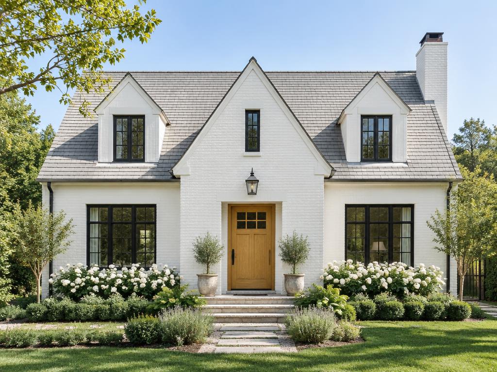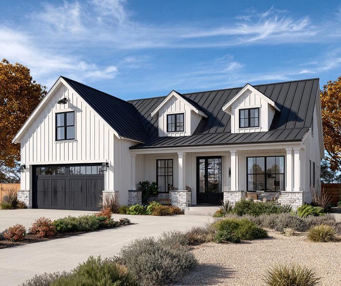
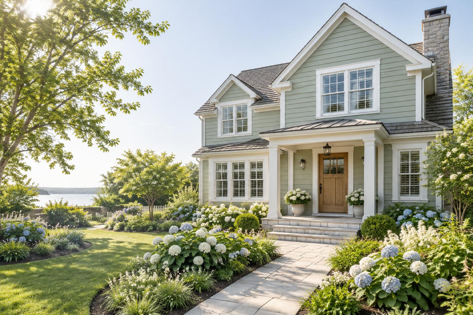
There is something about a cottage that makes you want to step inside. The cozy proportions, the pitched rooflines, the little front porch and the garden out front all say the same thing: welcome home. The right paint colors can make that feeling even stronger. Cottage exteriors are all about softness and warmth. Muted greens, creamy whites, gentle blues and earthy neutrals look beautiful against gardens, stone paths and weathered wood. A cheerful door color adds a personal touch, while crisp trim keeps everything looking fresh. Below are twelve cottage exterior color schemes that feel warm, inviting and timeless. Each one includes a color palette with suggested paint colors, so you can picture the finished look and take the ideas to your paint store.
What Makes a Cottage Palette Feel Warm
A few simple ideas help a cottage color scheme feel cozy instead of cold. • Warm undertones. Creamy whites, soft beiges and gentle yellows feel friendlier than stark white or cool gray. • Soft, muted colors. Dusty greens, faded blues and gentle blush tones look natural beside plants and flowers. • Contrast with care. Trim a shade lighter or darker than the body shows off charming details without feeling harsh. • A welcoming door. A single warm or cheerful color on the front door draws the eye and says “come on in.” • Natural materials. Stone, brick, wood and metal all add texture, so let your paint colors work with them.
Start with What You Cannot Change
Before you pick colors, look at what will stay the same. Your roof, brick, stone chimney and walkway already have a color and undertone, and your palette should flatter them. • Roof: Gray and black roofs pair well with cooler and neutral palettes. Brown and tan roofs look best with warm tones. • Stone or brick: Look for hints of red, tan, gold or gray, and choose colors that echo them. • Landscaping: Think about the flowers and foliage that will surround the house, since they become part of your color scheme. Hold paint chips right against your stone or brick. If they look like they belong together, you are on the right track.
12 Cottage Exterior Color Schemes
Paint colors below are from Sherwin-Williams. The swatches are close on-screen approximations, so always confirm with a real paint sample before you buy.
1. Soft White Cottage with a Sage Door
Body: Alabaster — SW 7008 Trim: Pure White — SW 7005 Door: Evergreen Fog — SW 9130 A creamy white body feels clean and cozy at the same time. The soft sage door adds a touch of color that looks right at home next to garden greenery.

2. Butter Cream with Forest Green Shutters
Body: Navajo White — SW 6126 Trim: Pure White — SW 7005 Shutters: Rookwood Dark Green — SW 2816 A warm, buttery cream glows in the afternoon light, and deep green shutters give the cottage a classic, storybook look.

3. Sage Green Garden Cottage
Body: Svelte Sage — SW 6164 Trim: Alabaster — SW 7008 Door: Cavern Clay — SW 7701 Sage green helps the house melt into the garden. A terracotta door adds warmth and looks beautiful against the soft green.

4. Dusty Blue Seaside Cottage
Body: Languid Blue — SW 6226 Trim: Pure White — SW 7005 Door: Redend Point — SW 9081 Soft blue feels breezy and relaxed, perfect for cottages near the water or any home that wants a gentle, cheerful look. A warm blush door balances the cool body color.

5. Warm Greige with Black Accents
Body: Accessible Beige — SW 7036 Trim: Alabaster — SW 7008 Accents: Tricorn Black — SW 6258 Greige is a cozy neutral that goes with almost any roof and landscaping. Black window frames and a black door add a modern touch to a classic cottage shape.

6. Soft Gray with a Navy Door
Body: Repose Gray — SW 7015 Trim: Pure White — SW 7005 Door: Naval — SW 6244 A light warm gray keeps the look current, while white trim keeps it crisp. A navy door adds depth and elegance without feeling heavy.

7. Blush Cottage with Cream Trim
Body: Redend Point — SW 9081 Trim: Alabaster — SW 7008 Door: Evergreen Fog — SW 9130 This warm blush-beige feels soft and romantic without looking too pink. Cream trim and a sage door make it feel like a cottage straight out of a storybook.

8. Gray Cottage with a Golden Door
Body: Mindful Gray — SW 7016 Trim: Pure White — SW 7005 Door: Humble Gold — SW 6377 A mid-tone gray makes a calm backdrop for a cheerful golden door. It is a simple way to add sunshine to the front of your home.

9. Rustic Red Cottage
Body: Rookwood Red — SW 2802 Trim: Alabaster — SW 7008 Accents: Tricorn Black — SW 6258 A deep, earthy red has a long history on cottages and cabins. Cream trim lightens it up, and black accents keep it grounded and polished.

10. Pale Aqua Cottage with a Teal Door
Body: Rainwashed — SW 6211 Trim: Pure White — SW 7005 Door: Rainstorm — SW 6230 A soft aqua-gray feels fresh and airy, and a deeper teal door ties the palette together in a tone-on-tone look.

11. Charcoal Cottage with Cream Trim
Body: Peppercorn — SW 7674 Trim: Alabaster — SW 7008 Door: Natural stained wood — natural material Dark charcoal feels rich and modern on a small cottage. Cream trim and a warm wood door keep it inviting instead of severe.

12. Earthy Taupe with a Deep Green Door
Body: Kilim Beige — SW 6106 Trim: Shoji White — SW 7042 Door: Dried Thyme — SW 6186 Warm taupe and soft white create a gentle, natural look. A deep green door gives the front of the house a rich, welcoming focal point.

Choosing the Right Finish
The sheen of your paint changes how colors look and how well they last. • Siding and stucco: flat or low-sheen finishes look soft and natural. • Trim and shutters: satin or semi-gloss helps the details stand out and wipe clean. • Doors: semi-gloss or gloss is durable and easy to maintain. • Porch floors: use a floor-rated enamel in satin. Always follow the product label for temperature range, primer needs and drying times.
How to Test Your Colors
Paint chips can be very misleading outdoors, so take time to test your favorites. 1. Paint large samples, at least two feet square, on primed boards. 2. Place them on several sides of the house, since light changes from wall to wall. 3. Check them at different times of day, including morning, midday and evening. 4. Compare them next to your roof, stone and landscaping. 5. Step back to the street and see how they look from a distance.
Common Mistakes to Avoid
• Choosing colors that clash with the roof or stone. Always compare undertones side by side. • Going too bold on every surface. Keep the palette simple and save the boldest color for the door or accents. • Skipping the test. A color that looks perfect on a chip can look completely different on the house. • Ignoring neighborhood rules. Check your HOA or historic district guidelines before you buy paint. • Forgetting the garden. Plants and flowers are part of your palette, so choose colors that flatter them.
Final Thoughts
The best cottage color scheme is the one that makes you smile every time you pull into the driveway. Start with your roof and stone, choose a soft body color you love, add crisp trim and finish with a door that feels like a warm hello. With a little patience and a few good samples, your cottage can look charming, cozy and welcoming for years to come.
Palette swatches are close on-screen approximations of Sherwin-Williams colors. Always confirm with a real paint sample before you buy. The cover photo is an AI-generated illustration.