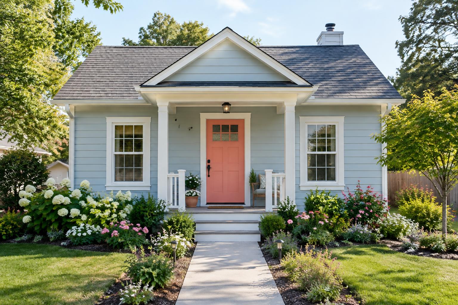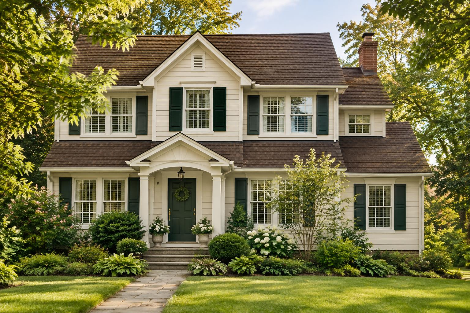
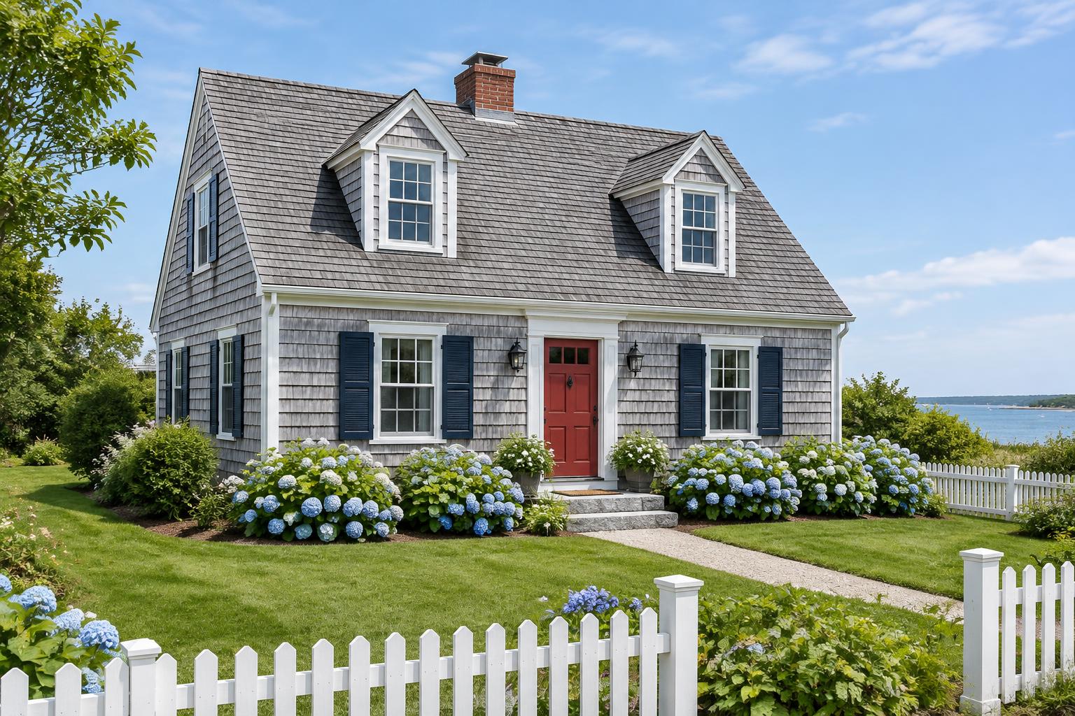
Few home styles feel as relaxed and enduring as the Cape Cod. Steep gabled roofs, tidy symmetry, dormer windows, weathered shingles and a front door that opens onto a hydrangea-lined path all say the same thing: welcome home. The colors that go with this style are just as classic, drawn from the sea, the dunes, the sky and the silvery wood of old shingled cottages. Whether you are repainting an original Cape or building a new home inspired by the style, the right exterior palette can keep it looking fresh for decades. This guide explains what makes Cape Cod color schemes so timeless, then shares twelve classic combinations with the body, trim, shutter and door colors laid out for you, complete with hex codes.
What Defines a Cape Cod Color Scheme
Cape Cod homes have a recognizable look, and their palettes tend to follow a few simple rules. Soft, weathered bodies. Silvery grays, soft whites, muted blues and gentle neutrals mimic wood aged by sun and sea air. Crisp white trim. Bright white trim outlines the windows, corners and rooflines and gives the house a clean, tidy look. Painted shutters in a deeper shade. Navy, black, forest green and slate blue are traditional shutter colors that add depth and contrast. A cheerful front door. The door is the place for a pop of color, such as red, yellow, coral or navy. Natural finishes. Many Capes keep cedar shingles natural or lightly stained, so paint colors have to work with weathered wood.
Start with Your Roof and Materials
Before you choose a palette, look at what is fixed on your home. Roof: Gray, black and brown roofs are the most common on Capes. Hold paint chips against your actual roofing outdoors. Siding material: Cedar shingles, clapboard and vinyl all take color differently. Wood shingles often look best with a semi-transparent stain or soft paint, while clapboard suits a wider range of colors. Chimney: Brick or stone chimneys have their own undertones, so make sure your colors complement them. Landscaping: Hydrangeas, beach roses, dune grass and white picket fences are part of the look. Light: Coastal sun is bright and reflective, which can make colors look lighter than they do on a chip.
12 Classic Cape Cod Color Combinations
The swatches and hex codes below are close on-screen approximations. Always bring them to your paint store for matching and test real samples on your home before you buy.
1. Weathered Gray with Navy Shutters
Silvery gray siding is the signature Cape Cod look. White trim keeps it crisp, navy shutters add depth and a red door gives it a traditional welcome. Best for: Shingled Capes near the coast and homes with gray or black roofs.
2. Classic White with Black Shutters
A clean white body with black shutters and a red door is a timeless New England combination. It looks sharp, balanced and always in style. Best for: Traditional Capes with clapboard siding and landscaped front yards.
3. Soft Blue with a Sunny Door
A gentle blue feels like a clear day by the water. Navy shutters ground the palette, and a yellow door adds a cheerful touch. Best for: Beach houses and Capes near water.
4. Honey Cedar with Forest Green
A warm, wood-toned body looks natural and cozy. Forest green shutters and a brick red door give it a classic, storybook look. Best for: Capes with natural or stained shingles and wooded or garden settings.
5. Butter Yellow with Seaside Blue
Soft yellow looks sunny and welcoming, and blue shutters echo the sea. A coral door adds warmth and charm. Best for: Cheerful cottages and sunny lots.
6. Sage Green with Cream Trim
Sage green feels calm and natural beside beach grass and garden plants. A terracotta door gives it an earthy pop. Best for: Capes surrounded by gardens, dunes or trees.
7. Greige with Navy and Coral
Greige is a flexible neutral that suits almost any roof. Navy shutters and a coral door make it feel polished and fresh. Best for: Updated Capes and homes with mixed materials.
8. Charcoal Gray with White Trim
A deeper gray makes a Cape feel rich and modern. Crisp white trim stands out beautifully, and a wood door adds warmth. Best for: Modern Capes and homes with black or gray roofs.
9. Pale Gray with Hunter Green
A light gray is soft and calm, while hunter green shutters feel classic and elegant. A mustard door adds a golden glow. Best for: Traditional Capes with brick chimneys and brown roofs.
10. Creamy White with Sea Glass
A warm white body and soft sea glass shutters feel breezy and relaxed. A navy door gives the palette a crisp anchor. Best for: Coastal Capes and homes that want a gentle, airy look.
11. Dusty Blue-Gray with Soft Black
A muted blue-gray feels like fog on the water. Soft black shutters and a rust door add richness and contrast. Best for: Shingled Capes in cool, misty climates.
12. Warm Taupe with Cream and Burgundy
A warm taupe body looks cozy and classic. Dark brown shutters and a burgundy door add depth and a touch of romance. Best for: Capes with brown roofs and brick or stone details.
How to Use Each Color
A Cape Cod palette looks best when each color has a clear job. Body: Choose a soft, weathered tone that suits your roof and landscape. Trim: Keep it white or cream so the windows, corners and dormers stand out. Shutters: Pick a deeper color that contrasts with the body. Traditional choices are navy, black and green. Front door: Use a bold or cheerful color. It is the main focal point. Details: Gutters, downspouts and porch railings usually match the trim or the body.
Choosing the Right Finish
The sheen of your paint and the type of finish affect both appearance and durability. Clapboard siding: flat or low-sheen finishes look soft and natural. Cedar shingles: consider a semi-transparent stain if you want the wood grain to show, or a quality exterior paint if you want solid color. Trim and shutters: satin or semi-gloss helps the details stand out and wipes clean easily. Doors: semi-gloss or gloss gives a polished, durable finish. Porch floors: use a floor-rated enamel in satin. Always follow the product label for temperature range, primer needs and drying times, and ask your paint store about the best products for coastal conditions.
How to Test Your Colors
Coastal light can change colors dramatically, so testing matters. 1. Paint large samples, at least two feet square, on primed boards or an inconspicuous area of the wall. 2. Place them next to your roof and chimney to compare undertones. 3. Move them around the house. Sunny and shaded sides can look very different. 4. Check them at different times of day, including morning, midday and evening. 5. Step back to the street and see how the colors read from a distance.
Common Mistakes to Avoid
Choosing trim that is too close to the body color. Cape Cod style depends on crisp contrast to outline the details. Using too many colors. Three or four colors are plenty, including the door. Ignoring the roof. The roof is a major color on the house even if you are not painting it. Skipping the test. A color that looks perfect on a chip can look very different in bright coastal sun. Forgetting local rules. Many historic and coastal communities have guidelines, so check before you buy paint.
Final Thoughts
A Cape Cod home looks best when its colors feel natural, calm and a little bit nostalgic. Start with your roof and materials, choose a soft, weathered body color, finish it with crisp white trim and add shutters and a door that bring in depth and personality. Test your samples in real light, take your time and trust your eye. With a thoughtful classic palette, your Cape Cod will look beautiful, welcoming and timeless for generations to come.
The cover image is AI-generated. House color examples use the hex codes supplied in the article. These are close on-screen approximations, not exact paint matches; test real samples on your home before buying.