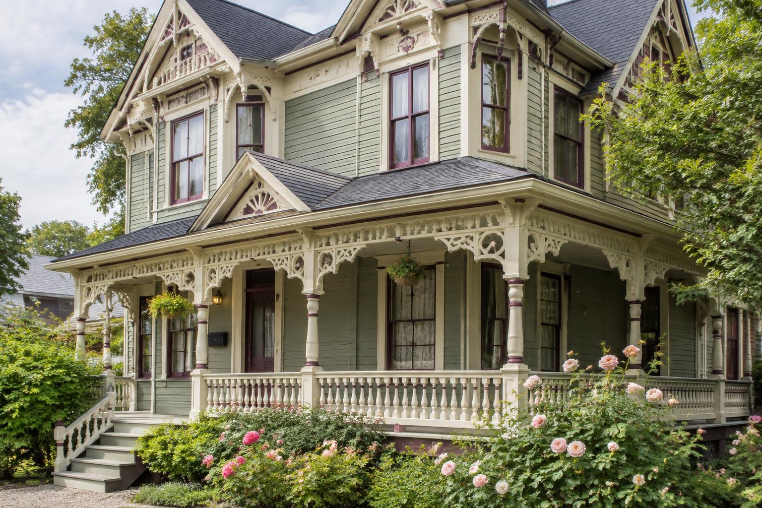
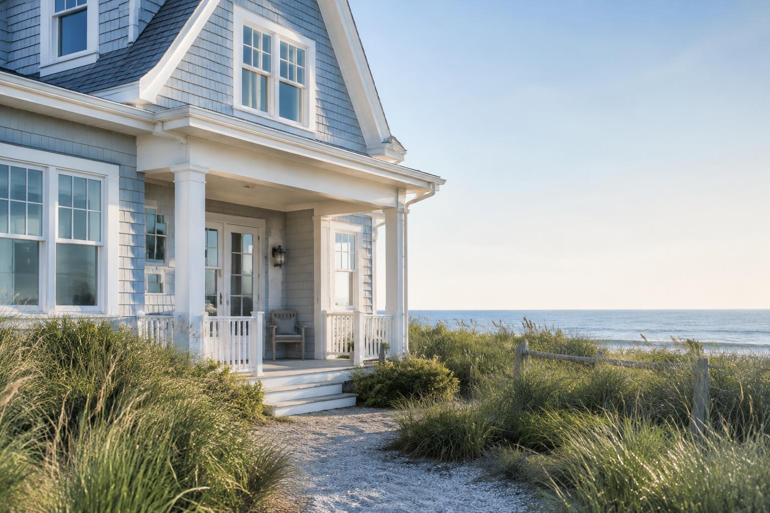
There is a special kind of calm that comes with a beach house. The light is brighter, the air feels lighter and everything seems to slow down. The right exterior colors can bring that feeling to life before you even step inside. Beach house colors are inspired by what you see around you: sand, shells, sea glass, driftwood, morning fog and open sky. The best palettes feel relaxed and natural, and they never look dated because they borrow from nature itself. This guide covers how to choose colors that suit coastal light and how to build a palette that stays beautiful year after year. Each example includes suggested paint colors so you can take the ideas to your paint store.
What Makes a Beach House Palette Feel Calm
A few simple ideas help a coastal color scheme feel peaceful instead of busy. • Soft, muted colors. Faded blues, sandy neutrals and gentle greens look natural beside water and sky. • Light-reflecting bases. Bright coastal sun makes colors look stronger, so softer shades often look best. • Gentle contrast. Crisp white trim defines the details without being harsh. • A single deeper accent. One darker or richer color, such as navy or deep teal, grounds the palette. • Natural materials. Weathered wood, rope, stone and metal all pair easily with coastal colors.
Start with Your Setting
Before you choose colors, think about where your house sits and how the light behaves. • Light: Beach sun is bright and often reflects off water or sand. Colors can look lighter and cooler in the glare, and richer in the shade. • Roof: Gray, black and cedar roofs lean toward cooler or warmer palettes, so hold chips against your roofing. • Siding material: Cedar shingles, board-and-batten and fiber cement all take paint differently, and weathered shingles may be happiest with a soft stain or a low-sheen paint. • Surroundings: Sand, dune grass, trees and neighboring homes all influence how your colors read. Hold paint chips outdoors against your roof, stone and landscaping to see what feels harmonious.
10 Calm and Timeless Beach House Palettes
Paint colors below are from Sherwin-Williams. The swatches are close on-screen approximations, so always confirm with a real paint sample before you buy.
1. Soft White with a Seafoam Door
Body: Alabaster — SW 7008 Trim: Pure White — SW 7005 Door: Quietude — SW 6212 A creamy white body feels clean and breezy, and a soft seafoam door adds a pop of coastal color that is gentle and fresh.

2. Sandy Beige with a Navy Door
Body: Kilim Beige — SW 6106 Trim: Pure White — SW 7005 Door: Naval — SW 6244 Warm sandy tones feel like a day at the shore. White trim keeps things crisp, and a navy door adds a classic nautical touch.

3. Weathered Gray Shingle
Body: Repose Gray — SW 7015 Trim: Pure White — SW 7005 Accents: Iron Ore — SW 7069 A soft gray echoes aged cedar shingles and looks right at home on the coast. Dark accents on the door and shutters give it quiet definition.

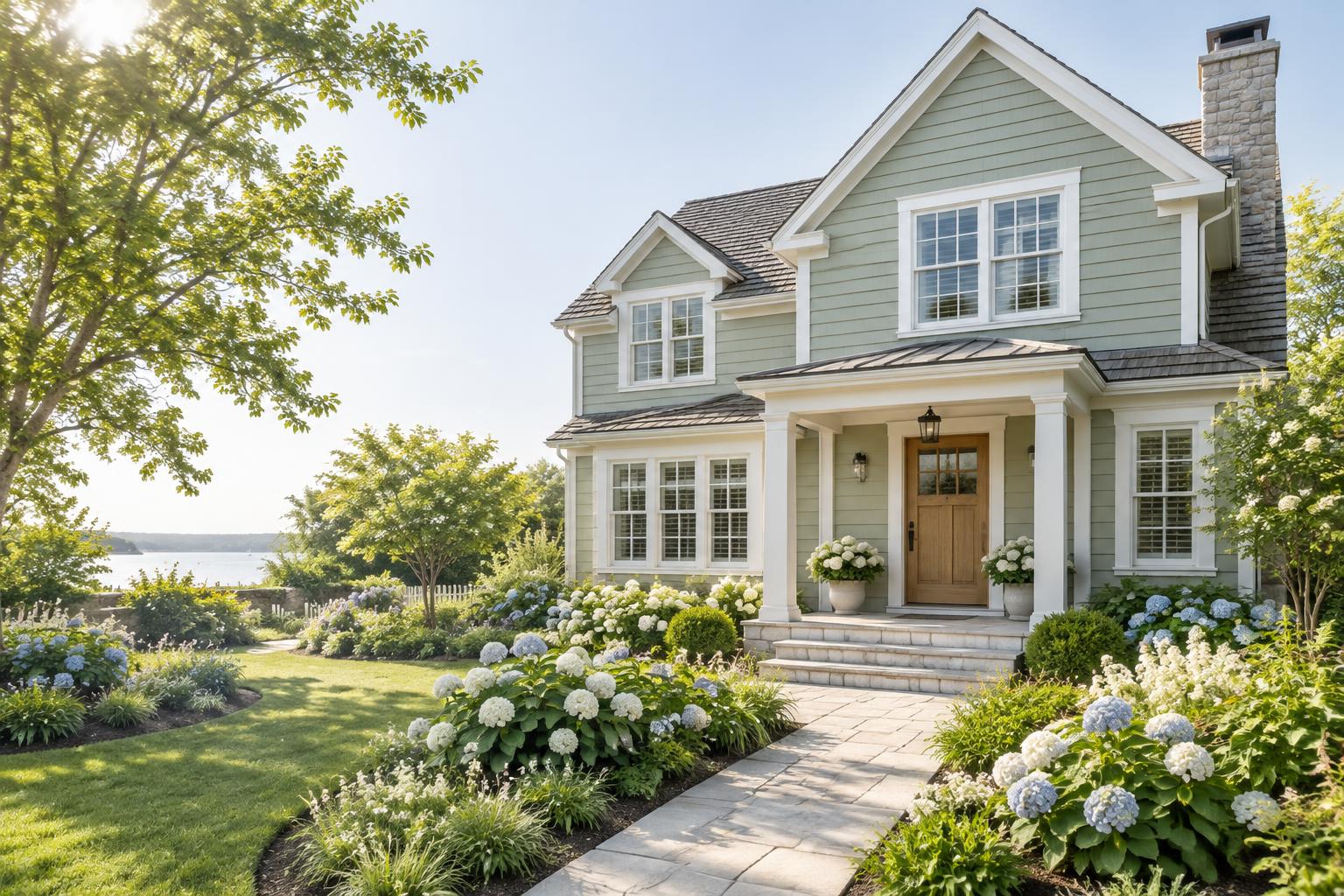
4. Sea Salt Green
Body: Sea Salt — SW 6204 Trim: Pure White — SW 7005 Door: Rainstorm — SW 6230 A misty green-gray looks like sea glass in the sun. A deeper teal door ties the palette together in a restful, tone-on-tone way.

5. Pale Blue with a Sandy Door
Body: Languid Blue — SW 6226 Trim: Pure White — SW 7005 Door: Redend Point — SW 9081 Soft blue feels like a clear morning sky. A warm sand-blush door balances the cool body color and adds a friendly welcome.

6. Buttercream with Blue Shutters
Body: Navajo White — SW 6126 Trim: Pure White — SW 7005 Shutters: Distance — SW 6243 A gentle buttery cream glows in the afternoon light, and slate-blue shutters give the house a relaxed, vintage seaside look.

7. Driftwood Taupe with a Sage Door
Body: Accessible Beige — SW 7036 Trim: Alabaster — SW 7008 Door: Evergreen Fog — SW 9130 A soft taupe mimics weathered driftwood and works with nearly any roof. A sage door brings in a hint of dune grass.

8. Deep Navy with White Trim
Body: Naval — SW 6244 Trim: Pure White — SW 7005 Door: Natural stained wood — natural material For a bolder look, deep navy feels rich and timeless against bright white trim. A wood door keeps it warm and inviting.

9. Misty Aqua with a Coral Door
Body: Rainwashed — SW 6211 Trim: Alabaster — SW 7008 Door: Fireweed — SW 6328 A pale aqua-gray feels airy and fresh. A warm coral-red door adds a cheerful, sunset-like pop of color.

10. Crisp White with Black Accents
Body: Dover White — SW 6385 Trim: Pure White — SW 7005 Accents: Tricorn Black — SW 6258 A clean, modern coastal look. Black window frames and a black door add graphic contrast against soft white siding.

Choose Finishes Made for Coastal Weather
Sun, humidity, wind and salt air are hard on exterior paint, so choose products and finishes with care. • Look for quality exterior paint rated for sun, humidity and mildew resistance, and follow the label for primer needs. • Siding and shingles: flat or low-sheen finishes look soft and natural. • Trim, shutters and doors: satin or semi-gloss resists wear and wipes clean easily. • Porch floors and decks: use a floor-rated enamel designed for foot traffic and weather. • Metal hardware: consider coastal-rated hardware to resist corrosion. Always follow the product label for temperature range, drying times and surface preparation, and talk to your paint store about the best system for your climate.
How to Test Your Colors
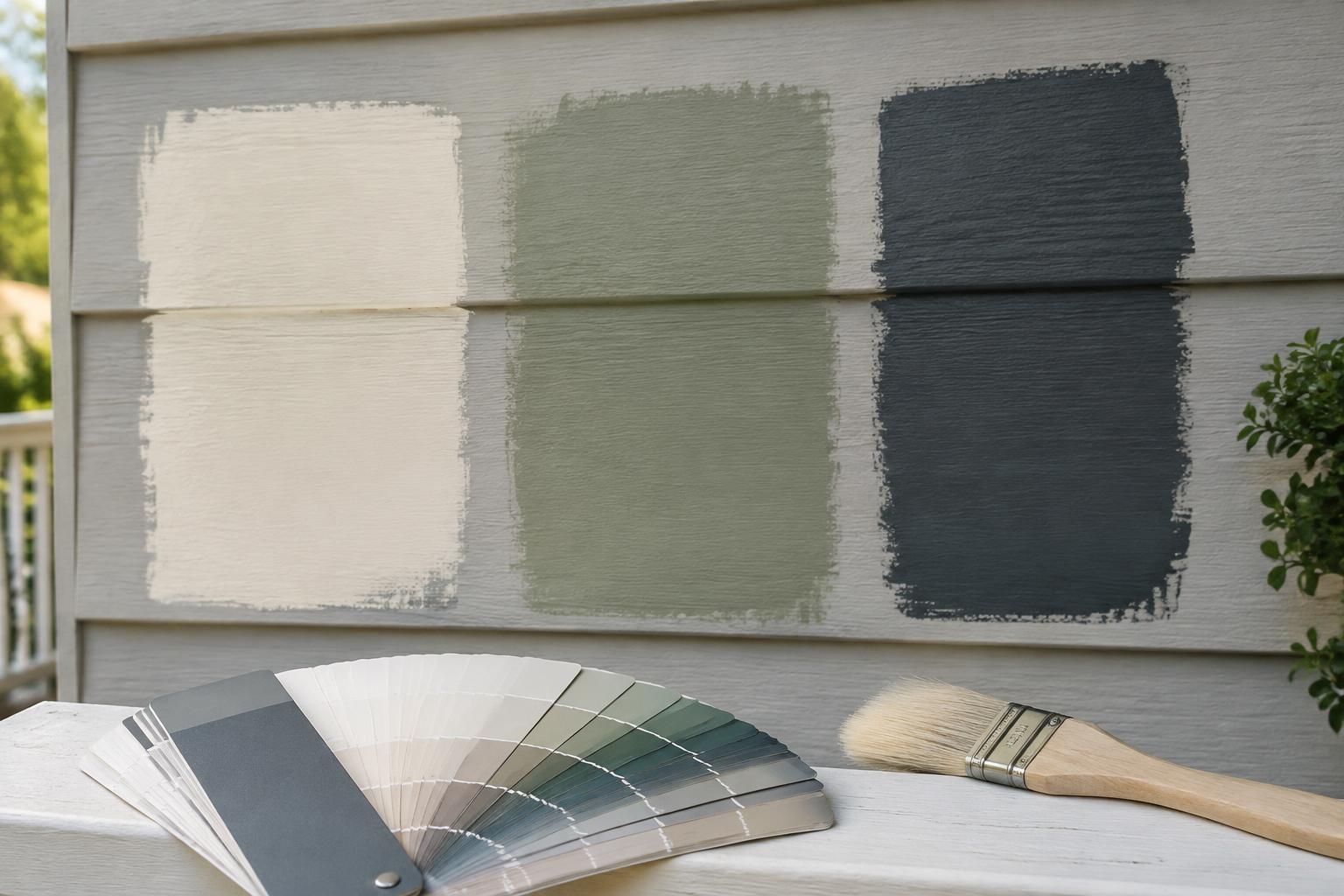
Coastal light can change colors dramatically, so testing matters. 1. Paint large samples, at least two feet square, on primed boards. 2. Move them around the house. Sun-facing and shaded sides can look very different. 3. Check them at different times of day, including bright midday, golden evening and cloudy weather. 4. Compare them next to your roof, trim and landscaping. 5. Step back to the street or beach path and see how they look from a distance.
Common Mistakes to Avoid
• Choosing a color that is too bold in full sun. Very saturated colors can look harsh in bright coastal light, so test first. • Using stark white next to warm sand tones. A softer white often looks more natural. • Skipping the roof and landscaping. They are major colors on the house even if you are not painting them. • Ignoring local rules. Many coastal communities have HOA or historic guidelines, so check before buying paint. • Forgetting maintenance. Salt air and sun are tough on paint, so plan for regular washing and touch-ups.
Final Thoughts
The most beautiful beach house palettes are the ones that feel like they belong where they are. Borrow from the sand, sea and sky, keep your colors soft and balanced, and choose one accent that makes you smile each time you come home. Test your samples in real coastal light, take your time and trust your eye. With a calm, thoughtful palette, your beach house will look beautiful and timeless for many summers to come.
Paint colors are from Sherwin-Williams. The swatches are close on-screen approximations, so always confirm with a real paint sample before you buy. The cover photo is an AI-generated illustration.